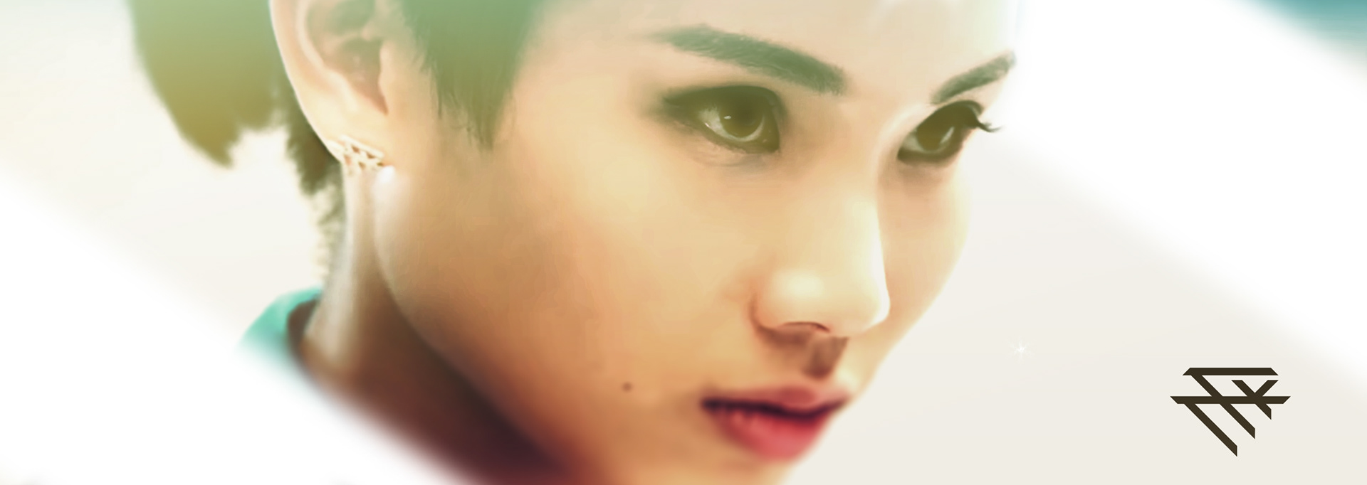
戴資穎 - Logo設計案
Client: TTY
Art Director / Ujhsu
Designer / Amy ,Ujhsu
Art Director / Ujhsu
Designer / Amy ,Ujhsu
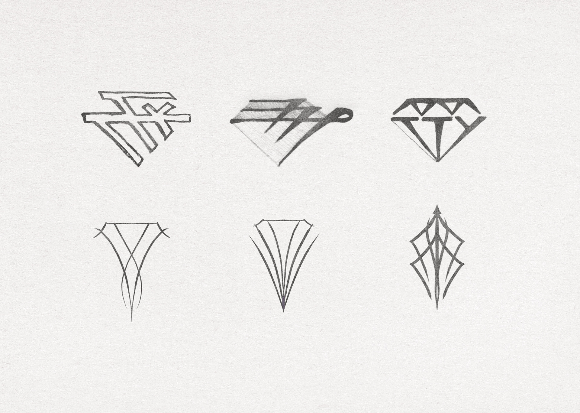
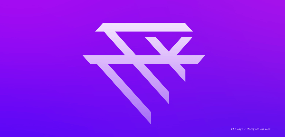
I will shape the diamond as an image, Tai Tzu Ying of the letters "TTY" for the design elements, Combined with the idea of logo. Look forward to Tai Tzu Ying can become a badminton world of diamonds, shiny shiny.
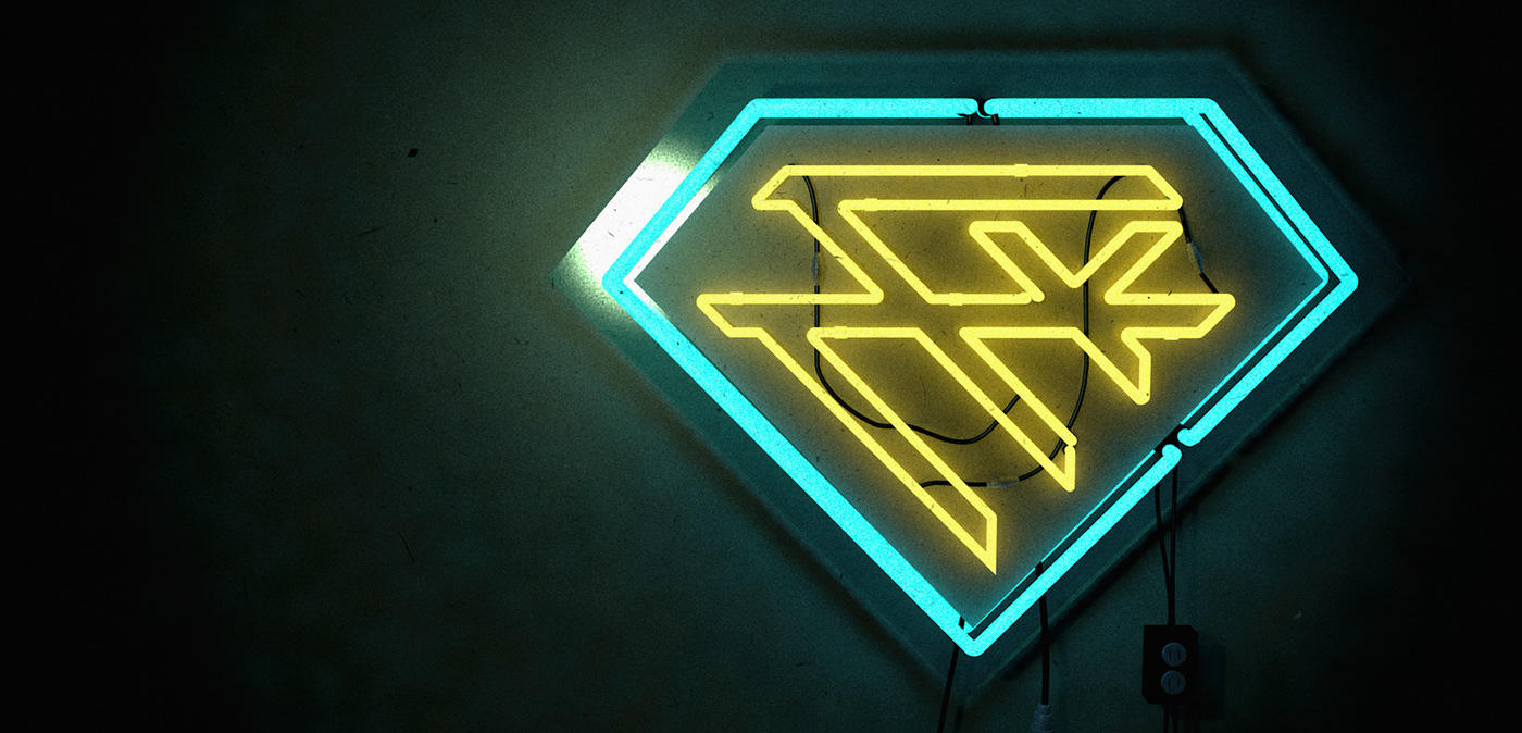
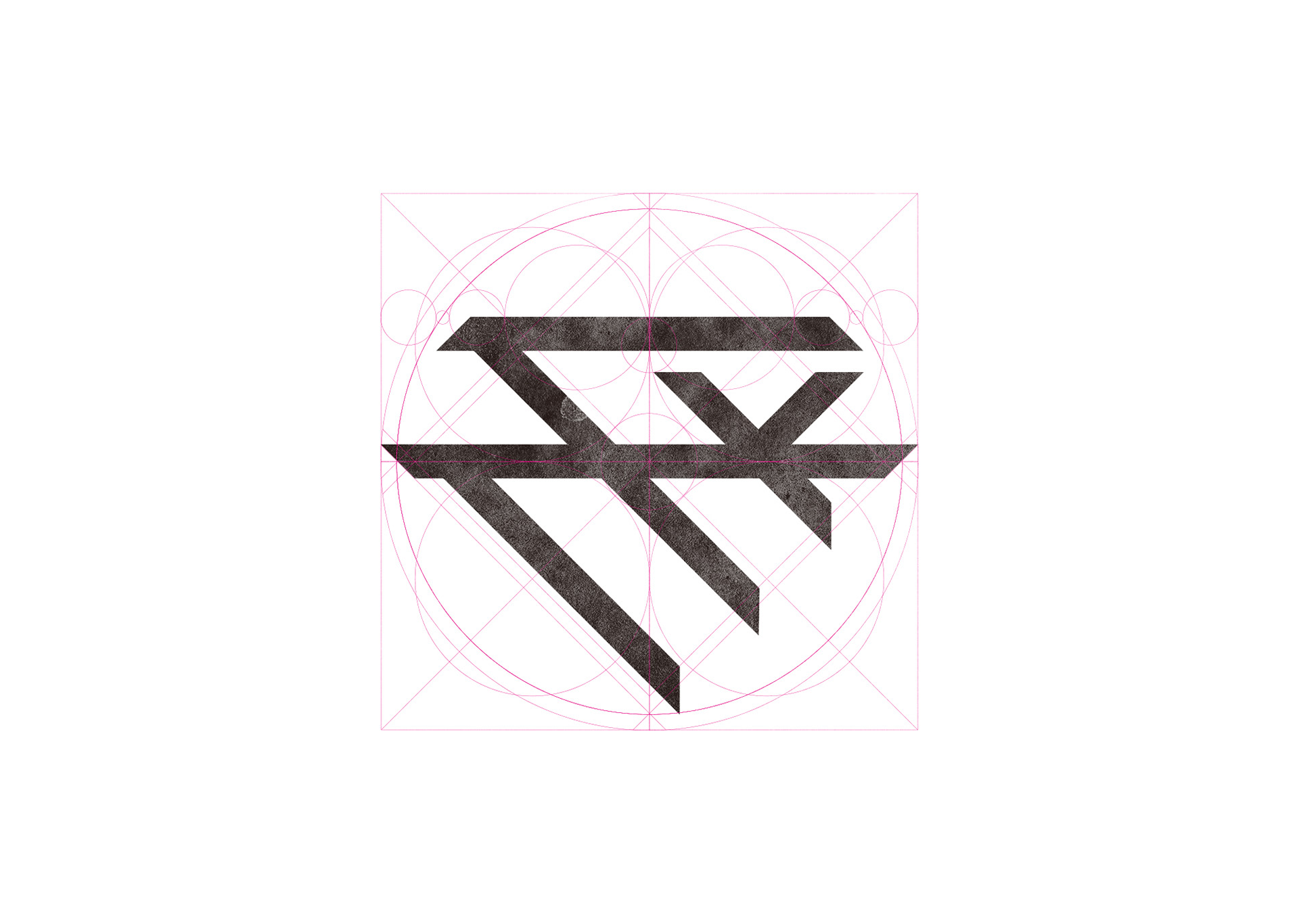
設計理念︰
以鑽石的原始切線切割出TTY字母,特別將Y改為小寫並反轉,想法來自戴資穎反手拍的招式。整體表現堅固、平穩的感覺,象徵堅不可摧的強大力量。
Cut the TTY letters with the original tangent of the diamond, Especially to Y to lowercase and reverse, The idea comes from Tai Tzu Ying backhand shot moves. The overall performance of a solid, smooth feeling. Symbolic indestructible powerful force.
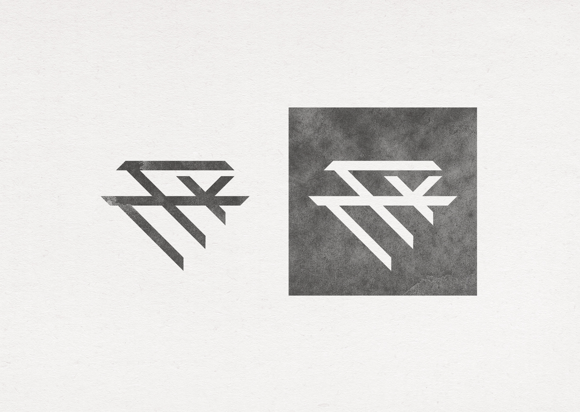
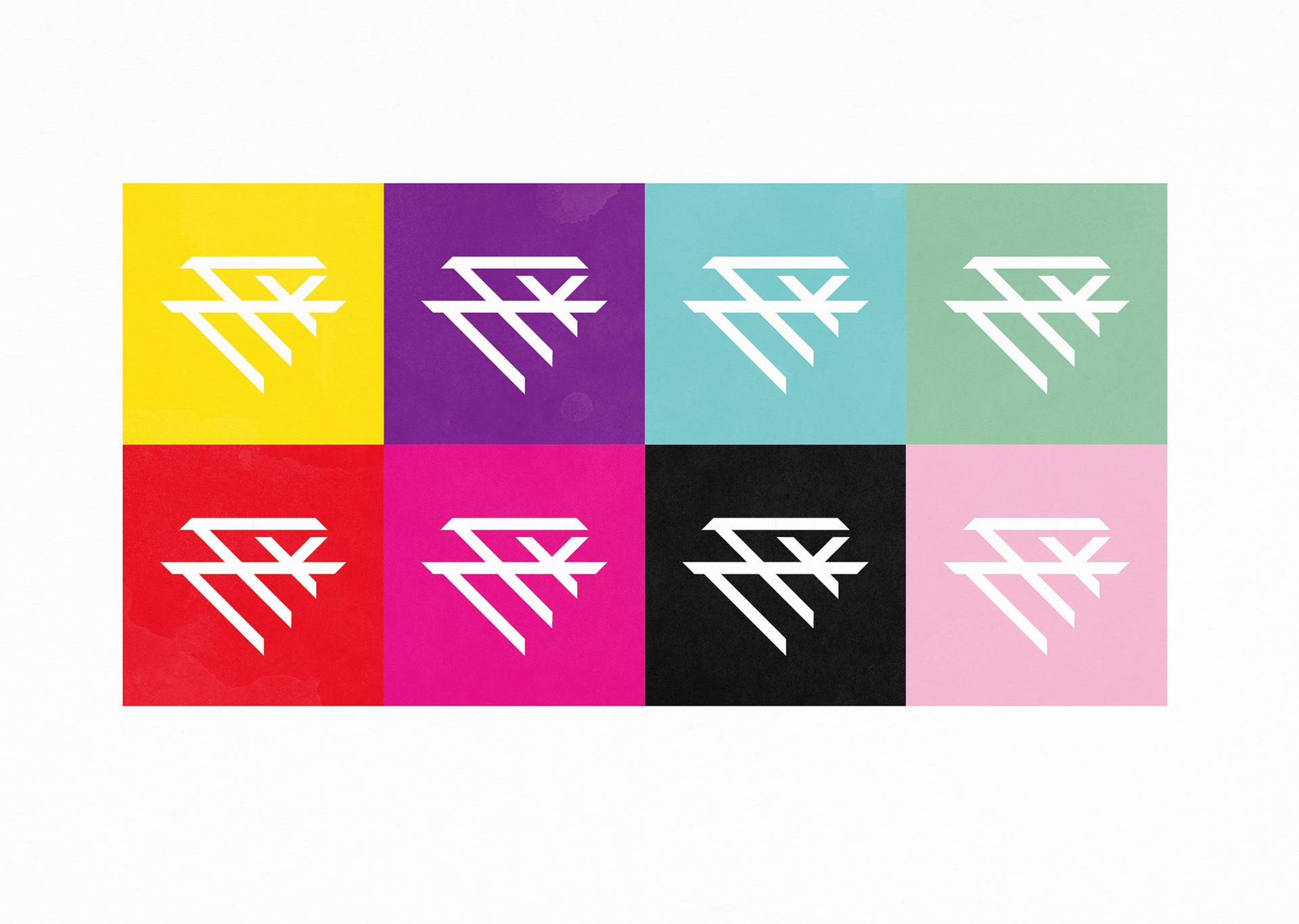
色彩選擇白色,白色能搭各式底色,產生不同的視覺打擊。
Color plan is white. White can take all kinds of background. Produce a different visual experience.
~ Let's Play ~